
Staynow OTA Platform
StayNow is an OTA platform aimed at simplifying hotel bookings for travelers and operations for independent hotel owners. In this case study, I walk through how thoughtful UX design transformed complex, fragmented experiences into a seamless, user-friendly journey for both guests and hoteliers.

My role
Sr UX Designer
1 year
Monterey, California
4 Junior UX Designers
Travel & Hospitality
$2.2 Million (Seed)
Challenge
Independent hotels often struggle to compete with large hotel chains due to limited visibility, high third-party commissions, and lack of direct digital tools. These challenges prevent them from reaching their full potential and growing sustainably. Our goal was to design a platform that empowers independent hotels to stand out, attract more guests, and manage their business efficiently without relying on costly intermediaries.a
Results
As part of StayNow’s 0–1 product build, we designed a unified ecosystem including the Super admin dashboard, Hotel admin panel, Customer-facing app, and website. Each touchpoint was crafted with a clean, intuitive interface to reduce friction, simplify navigation, and drive meaningful user actions across both hotelier and guest journeys.
25%
Sign-up to property listing conversion in the first 30 days
35%
User retention in the first month
300+
Properties onboarded in the first release cycle

Research

16 Days
50+
User interviews with hoteliers, travelers, and OTA experts to gather deep qualitative insights.
10+
Datapoints synthesized including field notes, journey maps, and interviews to define key personas and core problem areas.
User Personas
We crafted user personas based on interviews, surveys, and field research to represent key user types, helping align design decisions with real needs, behaviors, and goals.

Small Property Owner
Property Size 10–15 rooms
Location Tier 2 town
Tech Comfort Low
Needs
Easy onboarding and listing setup
Simple tools to update room status
Pain Points
Overwhelmed by complex OTA dashboards
Doesn’t understand how to price competitively
Misses bookings due to lack of real-time sync

Boutique Hotel Owner
Property Size 20–40 rooms
Location Tourist-heavy Tier 2 city
Tech Comfort Moderate
Needs
Unified dashboard with calendar and pricing control
Reporting on performance and occupancy trends
Pain Points
No easy way to run discounts or track trends
Feels invisible on major OTAs
Switching between tools wastes time

Multi-property Owner
Property Size 3+ properties
Location Tier 1 city
Tech Comfort High
Needs
Multi-property management from one login
Real-time analytics and price optimization tools
Pain Points
Struggles with bulk edits
Too many logins, lack of central control
Needs integration with external CRMs or tools
Design system & IA
Creating the Design System
We built a scalable design system from the ground up using design tokens for color, spacing, and typography, ensuring consistency across the web, app, and admin panels. Components were modular, responsive, and optimized for reusability to support rapid product growth and visual harmony.

Information Architecture
We mapped out a clear and scalable information architecture to streamline user flows across the Super Admin, Hotel Admin, and guest-facing platforms.

Final Designs
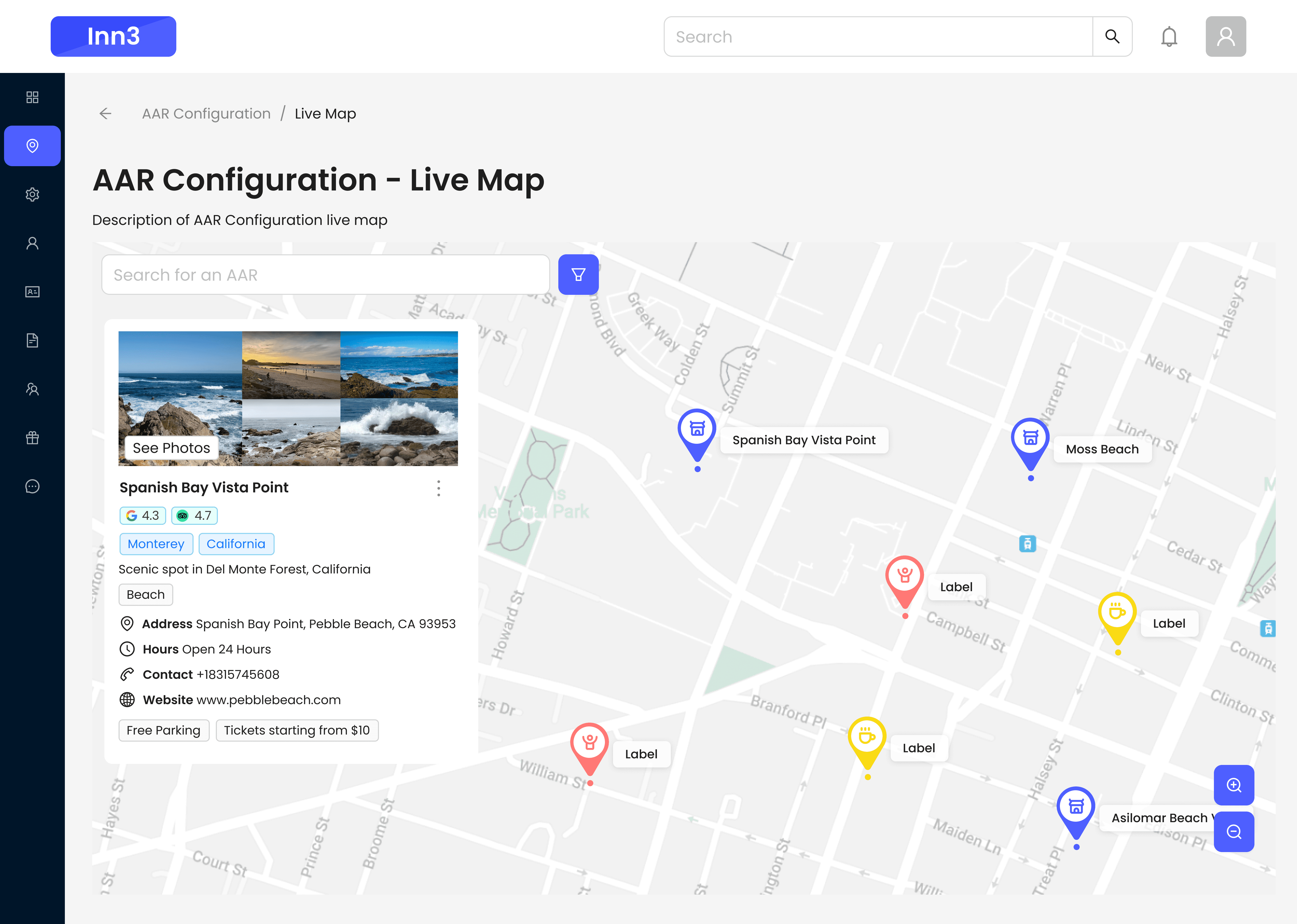
Handling Map Pin Congestion
In crowded travel areas, overlapping pins made property discovery frustrating. We introduced smart clustering, priority based sorting, and interactive tooltips, making it easier for users to explore, zoom in, and find the right listing without the clutter.

Before
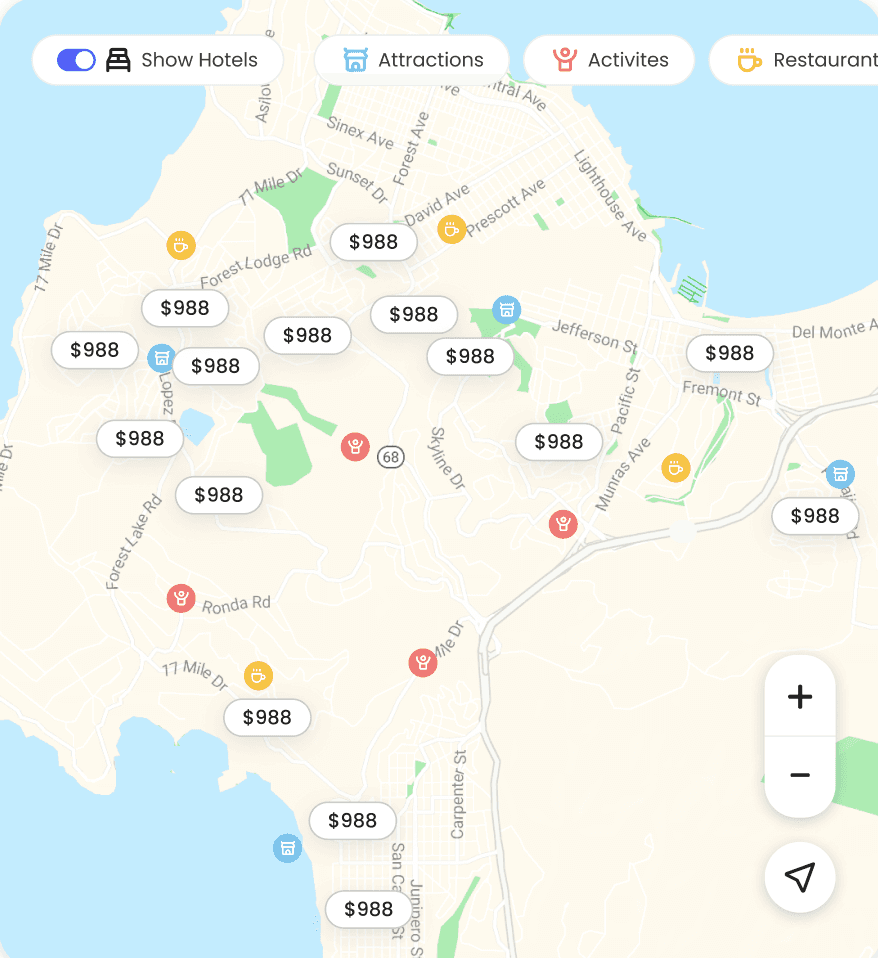
After
Seamless Booking
We designed a frictionless booking flow with intuitive steps, transparent pricing upfront, and clearly stated cancellation policies building trust and reducing drop-offs at checkout.

Hotel Admin Panel
The Hotel Admin panel was designed to simplify daily operations for property owners. It includes a clear dashboard, intuitive listing and calendar management, real-time booking controls, and smart pricing tools. The goal was to reduce complexity and give hoteliers full control without technical friction.


StayNow App
The StayNow app was designed to offer travelers a fast, intuitive, and trustworthy booking experience. With clear navigation, smart filters, map-based discovery, and upfront pricing, users can easily find and book stays that match their preferences. Key focus areas included building trust through transparent policies, rich visuals, and simplified checkout
“ Working with Rohith was a game changer. He had this rare ability to deeply understand both our users and our vision, and turned that into experiences that just made sense. The way they approached problems with empathy and clarity is a big reason StayNow feels so intuitive today.”

Siddharth Raj
CPO, Co-founder | StayNow
Conclusion
Building StayNow from 0 to 1 wasn’t just about launching a product it was about solving real problems for real people. By blending deep user research with clear design thinking, we turned complexity into clarity for both hoteliers and travelers. From streamlining onboarding to creating trust-driven booking flows, every decision was rooted in empathy and usability. The result? A platform that feels effortless, intuitive, and ready to scale.