Ecolab Sales and Service

Ecolab’s Sales & Service app is a vital tool for field teams who manage customer visits, track service tasks, and stay on top of daily operations. But the app wasn’t keeping up, it felt outdated, cluttered, and didn’t reflect the fast, on-the-go reality of its users.

This project was all about reimagining the app experience from the ground up. We focused on making the interface cleaner, the navigation faster, and the workflows more intuitive so sales reps and service techs could get things done quickly and confidently, right from their phones.

My role

UX Designer (First in the company)

Duration

Duration

6 months

Location

Location

St Paul, Minnesota

Industry

Industry

Chemical (CRM tool)

End users

End users

25000+ Ecolab service agents

Challenge

Ecolab’s field teams rely on the Sales & Service app to get work done on the go, but many found it overwhelming and hard to use. Most weren’t tech-savvy, and the app’s cluttered screens and complex flows only made things harder.

Results

The redesign transformed how Ecolab’s field agents interacted with their core service tool, making it faster, simpler. This redesign turned a clunky internal tool into something agents actually wanted to use.

Faster task completion time across core service workflows

80%

Drop in support tickets related to app usability

60%

Uptick in same-day reporting, critical for operational efficiency
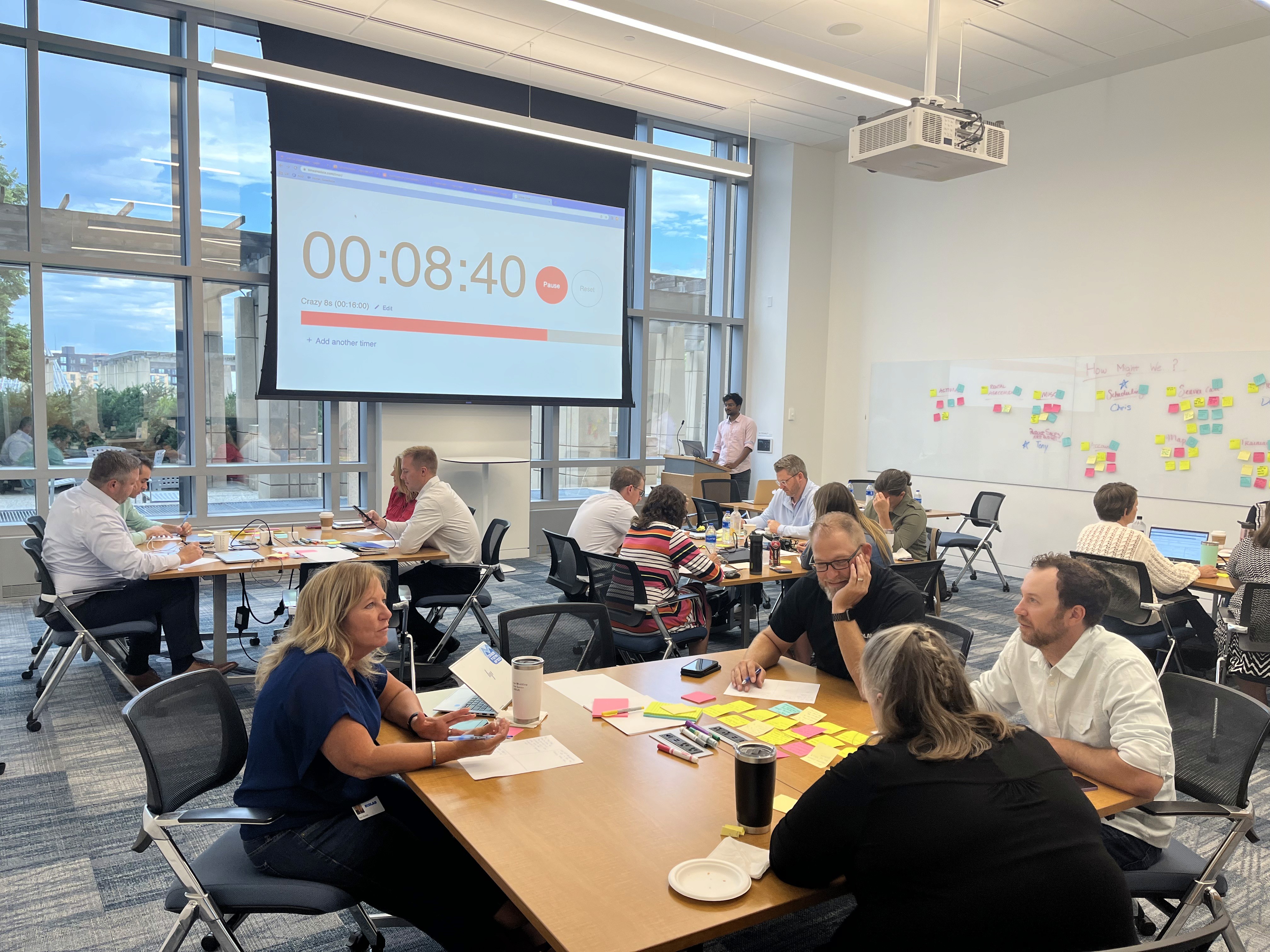
Research

Heuristic Evaluation

We began by conducting a heuristic evaluation of the existing Sales & Service app to identify usability issues based on established UX principles. Using Jakob Nielsen’s 10 usability heuristics as a guide, we audited core screens and workflows.


This helped us quickly surface problem areas and prioritize design improvements even before speaking to users, setting a strong foundation for targeted research and redesign.

Competitive Analysis


Next, we conducted a competitive analysis by reviewing service platforms used by companies in similar industries. This gave us insight into standard design patterns, common pitfalls, and emerging best practices in the customer service space.

Competitive Analysis


Next, we conducted a competitive analysis by reviewing service platforms used by companies in similar industries. This gave us insight into standard design patterns, common pitfalls, and emerging best practices in the customer service space.

Competitive Analysis


Next, we conducted a competitive analysis by reviewing service platforms used by companies in similar industries. This gave us insight into standard design patterns, common pitfalls, and emerging best practices in the customer service space.

Key findings

"Apps like ServiceMax and SAP Field Service used long, form-heavy flows, which slowed down service agents and led to incomplete entries under time pressure."

"Competing tools required formal onboarding sessions or manuals, which slowed down adoption in real-world conditions."

"Many apps lacked predictable patterns across screens, leading to frequent errors."

"Limited offline support made most competitor apps unreliable in the field, where spotty connectivity is common."

Key findings

Need to build an OTA platform that excels at building trust through storytelling, reviews, and visual design.

Common gap: All platforms have complex workflows for small property owners, making onboarding overwhelming.

Key findings

Need to build an OTA platform that excels at building trust through storytelling, reviews, and visual design.

Common gap: All platforms have complex workflows for small property owners, making onboarding overwhelming.

Usability Testing


We conducted a series of usability tests and contextual inquiries to understand how Ecolab’s field agents use the app in real-world service scenarios. This included observing workflows like product ordering, service call logging, task completion, and customer visit documentation.


By combining hands-on testing with live shadowing and follow-up interviews, we captured both interaction patterns and pain points, especially around clarity, navigation, and mobile usability. These insights helped us uncover where users were getting stuck, what they were skipping, and which steps felt unnecessarily complex in the field.

12+

On-ground contextual inquiries and workflow observations with Ecolab service agents to capture real usage patterns and field challenges.

30+

In-depth sessions with field technicians, regional managers, and support reps to evaluate key workflows.

10+

Datapoints synthesized including field notes, journey maps, and interviews to define key personas and core problem areas.

Key findings

"Service calls, order history, and customer notes were scattered across different screens, leading to context-switching and data loss."

"Many users weren’t sure if actions (like submitting a service report) were saved or sent, causing repeated inputs and frustration."

"Travelers reported that changing or canceling bookings is one of the most friction-filled parts of their experience."

"Small tap targets, low contrast, and dense forms made it hard for technicians to use the app during on-site service."

"Users preferred calling in orders or manually noting service updates due to fear of syncing errors or missing confirmations."

Key findings

Need to build an OTA platform that excels at building trust through storytelling, reviews, and visual design.

Common gap: All platforms have complex workflows for small property owners, making onboarding overwhelming.

Key findings

Need to build an OTA platform that excels at building trust through storytelling, reviews, and visual design.

Common gap: All platforms have complex workflows for small property owners, making onboarding overwhelming.

Design Sprint

We ran a 4-day design sprint with Ecolab service agents, product owners, and stakeholders. Together, we mapped real pain points, sketched ideas, and built a prototype. The sprint ended with potential solutions giving us fast, focused feedback from the people who use the app every day.

User Personas

We crafted user personas based on interviews, surveys, and field research to represent key user types, helping align design decisions with real needs, behaviors, and goals.

Experienced Field Technician


Background

Over 20 years in the field, highly skilled at servicing clients but less confident with digital tools


Behaviors

Prefers pen-and-paper backups, uses the app only when necessary


Pain Points

Small buttons, unclear steps, no offline mode


Needs

Clear, step-by-step flows, minimal text, and confirmation messages that reassure him things were saved

Mid-Level Service Agent


Background

Comfortable using apps like WhatsApp, Google Maps, and email.


Behaviors

Uses the app regularly but gets frustrated with slow workflows and cluttered screens


Pain Points

Hard to find customer info quickly, forms feel repetitive


Needs

Streamlined flows, smart defaults, and quick access to recent service history

New Field Associate


Background

Tech-savvy, quick to adapt, but new to Ecolab’s service process


Behaviors

Expects fast, intuitive mobile experiences like in consumer apps


Pain Points

App feels dated and rigid, no contextual help for newer users


Needs

Clean UI, helpful microcopy, guided steps, and faster performance

Design Process

Information Architecture

We mapped out the existing app structure and identified critical gaps in navigation, hierarchy, and labeling. By simplifying workflows and aligning them with real-world service agent tasks, we restructured the IA to reduce cognitive load, improve task discoverability, and ensure faster access to key features like service calls, product ordering, and reporting.

Low Fidelity Designs

We translated key user flows into low-fidelity wireframes to rapidly explore layout ideas and interaction patterns. These sketches helped align stakeholders early, prioritize essential features, and iterate quickly based on feedback before moving into detailed UI design.
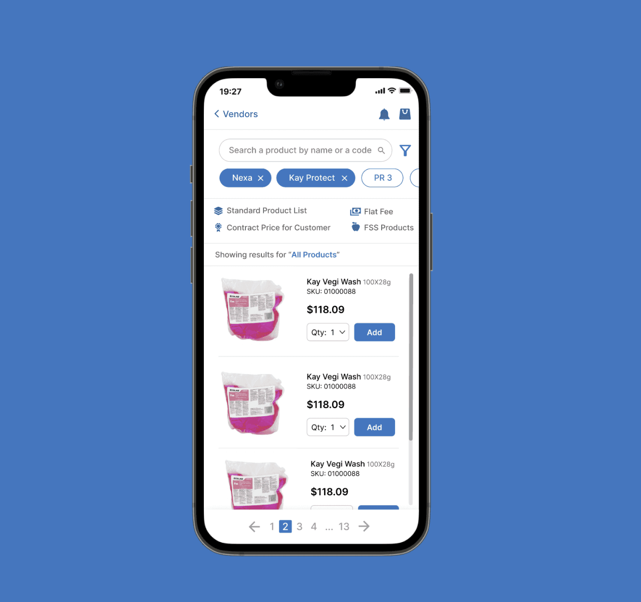
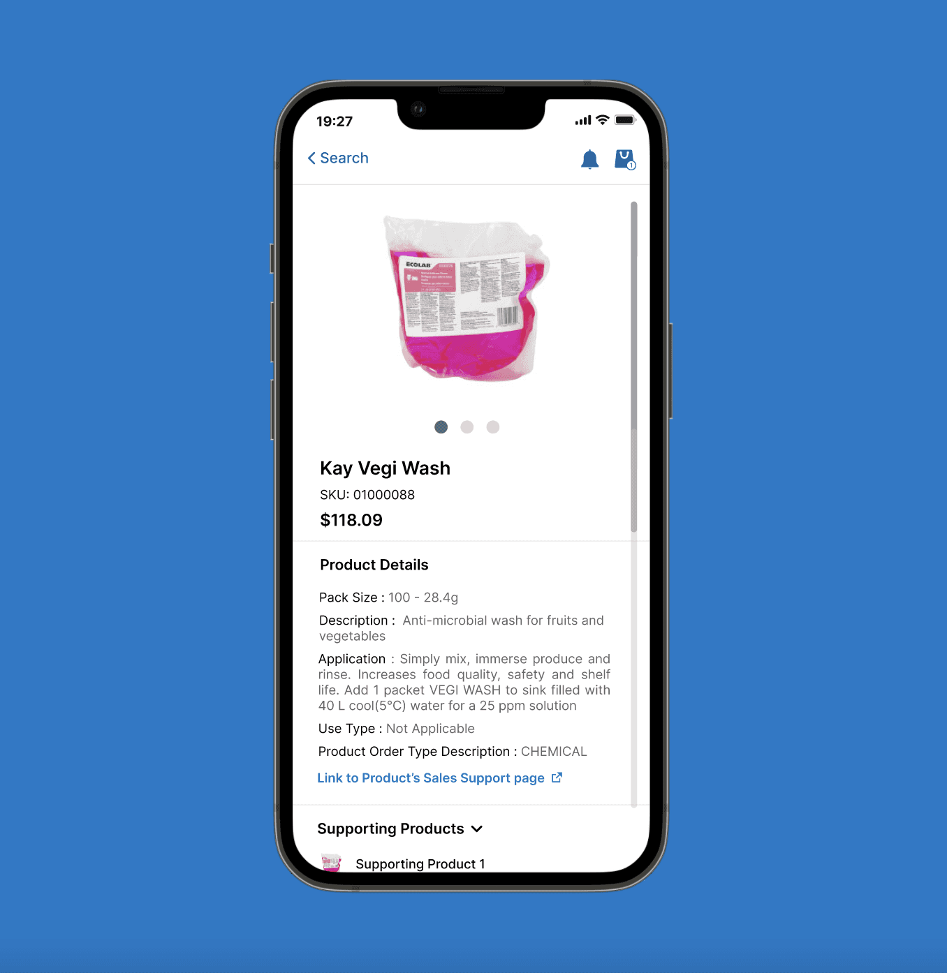
Final Designs

While I can’t share the full product due to NDA, here are a few selected screens that highlight key improvements. The redesign focused on simplifying core tasks like service logging and product ordering making the app feel faster, clearer, and easier for field teams to use in real-world conditions.

“ Rohith brought structure and empathy to a complex redesign. He quickly understood our agents day-to-day challenges and turned that into clean, usable workflows.”

Product Manager | Ecolab

Conclusion

This project wasn’t just about redesigning an app it was about making life easier for the people who use it every day. By spending time with service agents, listening to their challenges, and testing real workflows, we were able to design something that fits into their fast-paced, on-the-go world. It was a reminder that good design isn’t about flashy screens, it’s about creating tools that quietly make someone’s day a little smoother.